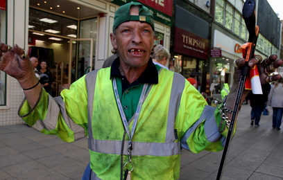
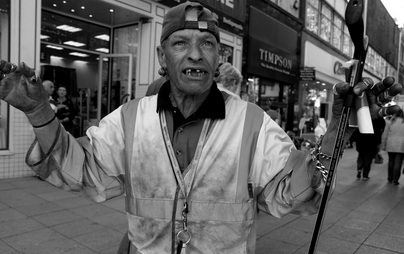
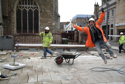
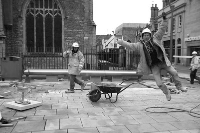
I face this dilemma, below, all the time. I shoot in colour, of course, but a lot of my early work is in black & white. Many of my modern subjects suit the mono treatment but I also put importance on reality. So, which is best? There's only one way to find out... ask the visitors to my website!
|
Four pictures of the week to make up for the lack of new photos on here for a while.
I face this dilemma, below, all the time. I shoot in colour, of course, but a lot of my early work is in black & white. Many of my modern subjects suit the mono treatment but I also put importance on reality. So, which is best? There's only one way to find out... ask the visitors to my website!
12 Comments
6/7/2011 10:58:34 am
Both colour versions work best for me. I love the power of dayglo!
Reply
6/7/2011 03:30:44 pm
Hi Chris!
Reply
Chris Porsz
6/7/2011 04:16:49 pm
Thanks Valerie for taking the time and your comments sum up my feelings too.
Reply
6/21/2011 04:42:12 pm
i like the b & w for the first one as the colour of his top is detracting from his face
Reply
Karen Butfield
6/24/2011 11:21:41 am
I prefer the b&w for the first one, find the coloured background distracting and the b&w makes the chap stand out more.
Reply
7/5/2011 05:56:45 am
Why not have the best of both worlds...selective color could work well for both images, but the second would benefit the most, in my opinion. In the first, I would only color the subject's clothes, or his skin, but not both. The second image would colorize only the 3 safety jackets, but is would increase contrast in the b/w areas for effect.
Reply
Lesley Riley
7/29/2011 08:09:20 am
black n white every time
Reply
10/7/2011 09:41:50 pm
The very first thing that caught my eye the instant I saw the first photo was the gentleman's facial expression. I was not at all deterred by the color. Next, I noticed his hands. Although he obviously gets quite dirty doing his job, he still wears jewelry.The color of his hat matches his shirt. Was that on purpose? The color photo made me think more about his personality. Looking at the black and white photo, I notice his expression, but I'm not prompted to think about the other things I mentioned. The color photo made me curious about his personality.
Reply
Chris Porsz
10/21/2011 05:29:43 am
Thank you Kimberly for taking the time to comment and I concur with what you say.Also you cannot appreciate his tanned face and warm lighting in mono. I tend to use colour when it adds something to an image and revert to mono when colour distracts.
Reply
jackie rob
10/25/2011 03:54:59 pm
Reply
jackie rob
10/25/2011 03:59:09 pm
I have always prefered B&W as it seems the focus is sharper but have to say that on this occasions both of the colour versions seem to "lift" the characters off the page, bring them more into the foreground so I noticed a lot more detail about them..
Reply
5/1/2024 08:21:17 am
This is very useful information! I've got totally relished examining ones details and have absolutely go to the conclusion that you'll be suitable in relation to quite a few. That you are good.
Reply
Leave a Reply. |
Incorporating Chris's photo of the weekEvery week or so, Chris will choose one of his photographs for discussion. Please look at previous images and comment on those, too. And feel free to suggest images for future photos of the week. Use the contact page (click). Archives
September 2023
Categories
All
|

 RSS Feed
